How to style your app in SwiftUI
Styling makes your product recognizable.
Styling makes your brand stronger.
Styling is key.
But when apps grow in size, styling gets harder and harder. That’s why centralize styling becomes a must. In this article, you will understand why styling schemes are necessary and how to create and apply a styling scheme using SwiftUI.
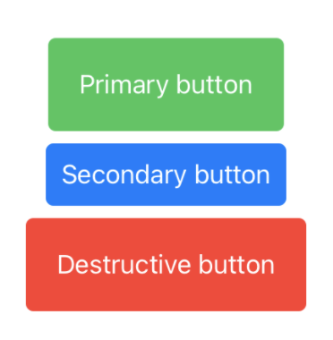
Check out this code about three different buttons:
struct StylingView: View {

	var body: some View {
		VStack {
			Button(action: {}){
				Text("Primary button")
			}
				.padding(20)
				.foregroundColor(Color.white)
				.background(Color.blue)
				.cornerRadius(5)

			Button(action: {}){
				Text("Secondary button")
			}
				.padding(10)
				.foregroundColor(Color.white)
				.background(Color.blue)
				.cornerRadius(5)

			Button(action: {}){
				Text("Destructive button")
			}
				.padding(20)
				.foregroundColor(Color.white)
				.background(Color.red)
				.cornerRadius(5)
		}
	}
}
This code works and looks good, but also has some problems.
- Repetitive code on every button will bring in the end to issues and failures.
- Hardcoded values: Colors, paddings, etc. are set directly on the view. If in the future color palette changes are needed, for example, due to a brand update, this will provoke modifying one by one every single element that needs to be changed.
These problems can be mitigated by the creation of a styling scheme.
1. Creating a styling scheme
A visual styling scheme is a structure that defines the visual aspects of the app: colors, fonts, and some other aspects of the interface elements.
Our sample styling scheme will include:
- A palette of colors to be used through the app
- A palette of button styles to be used through the app, based on the color palette
Color palette
The color palette will be the unique point to access the colors in the app.
Color changes must be made only within the color palette and will be automatically reflected in every element that uses it.
The color palette for our app will be composed of three main colors and another one for destructive actions.
enum ColorPalette {
	case primary
	case secondary
	case tertiary
	case destructive
	var color: Color {
		switch self {
		case .primary: return Color.green
		case .secondary: return Color.blue
		case .tertiary: return Color.gray
		case .destructive: return Color.red
		}
	}
}
Button scheme
A button style palette is a structure that generates button styles restricted to the buttons cases needed.
Every button needed for our app will be created using this ButtonStylePalette enumeration.
In this case, we need to display three different buttons: A primary button, a secondary, and a destructive one.
enum ButtonStylePalette: ButtonStyle {
   case primary
   case secondary
   case destructive
	func makeBody(configuration: Configuration) -> some View {
		switch self {
		case .primary:
			// To fill
		case .secondary:
			// To fill
		case .destructive:
			// To fill
		}
	}
}
As the ButtonStylePalette enumeration implements the protocol ButtonStyle, func makeBody() needs to be implemented. This function will have the responsibility to configure a view with all the attributes related to the corresponding button style.
We will come back to this function later.
2. Create a button style
A button style defines visual appearance, animations, and other aspects of the button
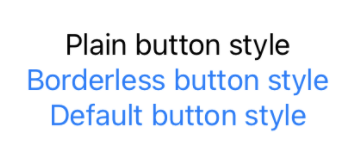
We can check some styles that Apple provides: PlainButtonStyle() , BorderlessButtonStyle() , and DefaultButtonStyle() .
Button(action: {}){
   Text("Plain button style")
}
.buttonStyle(PlainButtonStyle())

Button(action: {}){
    Text("Borderless button style")
}
.buttonStyle(BorderlessButtonStyle())

Button(action: {}){
    Text("Default button style")
}
.buttonStyle(DefaultButtonStyle())
Let’s create our custom style for the primary button:
struct PrimaryButtonStyle: ButtonStyle {
	var color: Color = ColorPalette.primary.color
	func makeBody(configuration: Configuration) -> some View {
		PrimaryButton(configuration: configuration, color: color)
	}
}

struct PrimaryButton: View {
	let configuration: PrimaryButtonStyle.Configuration
	let color: Color
	var body: some View {
		return configuration.label
		.padding(20)
		.foregroundColor(Color.white)
		.background(color)
		.cornerRadius(5)
	}
}
- Create a button style struct called
PrimaryButtonStyle, that returns the view needed for the button. The chosen color is taken from our color palette case.primary. - Create a
PrimaryButtonview. This view will include every visual aspect (foreground and background colors, padding, corner radius, etc.), and will be called from thePrimaryButtonStylestruct.We could integrate the
PrimaryButtoncontent intofunc makeBody(), but dividing the functionality into two different structs allows the flexibility to return a view or another, depending on the button state configuration, or any other environment property.
3. Configure the scheme
Back in our palette, now we can add the resultant views in func makeBody().
> Button views are wrapped inside an `AnyView()`, so the function can return different views
enum ButtonStylePalette: ButtonStyle {
	case primary
	case secondary
	case destructive

	func makeBody(configuration: Configuration) -> some View {
		switch self {
		case .primary:
			return AnyView(PrimaryButtonStyle(color: ColorsPalette.primary.color)
						.makeBody(configuration: configuration))
		case .secondary:
			// Return button styled view for secondary case
		case .destructive:
			// Return button styled view for destructive case
		}
	}
}
4. Use the styles
Apply the desired style to every button using the modifier .buttonStyle().
Button(action: {}){
	Text("Primary button")
}
.buttonStyle(ButtonStylePalette.primary)

Button(action: {}){
	Text("Secondary button")
}
.buttonStyle(ButtonStylePalette.secondary)

Button(action: {}){
	Text("Destructive button")
}
.buttonStyle(ButtonStylePalette.destructive)
Conclusion
Styling an app can be simple and easy to do when you use a styling scheme. It’s a clean way to avoid repetitive code and allows us to avoid a mess when escalating the app or just maintaining it.
Where to go from here?
The scheme created can evolve into a more powerful one, as you can integrate fonts, sizes, animations, etc. Anything that you can imagine about the visual appearance can get a place into the styling scheme.
Do you have any comment about this topic? Send me a message to pabloblancogonzalez@gmail.com