How to create a login screen in SwiftUI
In this article, we will build a login screen using SwiftUI with the next requirements:
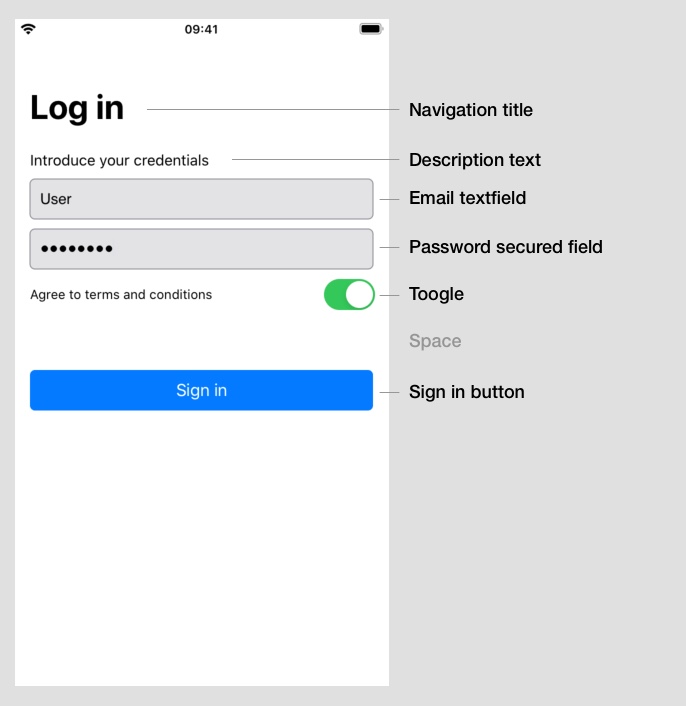
- Proposed layout
- Field validation: User & password textfields need to be filled and the toogle for Accept Terms and Conditions enabled
- If enabled, the button will display a message when pressed.
Topics you will learn about
1.- Creating a SwiftUI layout
2.- Declaring UI elements: Text, Textfield, Toogle and Button
3.- Setting and validating input data from these UI elements
4.- Wrapping the whole view for navigation
1. Layout
The layout to create consists of:
We start by creating a new SwiftUI view class called LoginView (File > New > File... > SwiftUI View):
struct LoginView: View {
    var body: some View {

    }
}
So, following the layout, let’s add the elements:
struct LoginView: View {

    //0
    @State private var email: String = ""
    @State private var password: String = ""
    @State private var agreedToTerms: Bool = false

    var body: some View {

            // 1. Vertical stack
            VStack() {

                // 2. Text
                Text("Introduce your credentials")

                // 3. Email field
                TextField("Email", text: $email)

                // 4. Password field
                SecureField("Password", text: $password)

                // 5. Toogle to agree T&C
                Toggle(isOn: $agreedToTerms) {
                    Text("Agree to terms and conditions")
                }

                // 6. Log in button
                Button(action: {
                    print("Logged in!")
                }){
                    Text("Log in")
                }

                // 7. Bottom spacer
                Spacer()
            }
    }
}
Don’t worry about the //0 variables declared on the top, we will go through them later.
// 1. Vertical stack
VStack()
In SwiftUI there are many ways to distribute our content on the screen. One of them is by using VStack, that means a vertical stack of elements.
Every element declared inside the container VStack will be included in a stack, following the declaration order.
In this case, our stack will be integrated by a text, two textfields, a toogle and a button (//2 to //6)
// 2. Text:
Text("Introduce your credentials")
This adds a text, in this case our screen description.
// 3. Email field
TextField("Email", text: $email)
A textfield allows users to add input data. In this case, it is used for capturing the user’s email.
The text Email corresponds to the textfield placeholder.
We will talk later about the text: $email declaration.
// 4. Password field
SecureField("Password", text: $password)
A SecureField is a textfield that allows secure data input, replacing text display with bullets. The string Password is its placeholder.
We will talk later about the text: $password declaration.
// 5. Toogle to agree T&C
Toggle(isOn: $agreedToTerms) {
    Text("Agree to terms and conditions")
}
Toogle allows users to set on/off a property. In our case, this toogle represents if the user accepts the Terms and conditions.
The toogle is composed by two elements:
- Left side: Any view needed. It should be included inside the brackets.
In this case is the text Agree to terms and conditions
- Right side: The toogle control. It is enabled/disabled depending on the variable included after the word
isOnonToggle(isOn: ...)
We will talk later about the $agreedToTerms declaration.
// 6. Log in button Defined as:
Button(action: {
    print("Logged in!")
}){
   Text("Log in")
       .frame(minWidth: 0, maxWidth: .infinity)
}
The button has two parts:
- Action: Indicates the action taken when the button is pressed.
action: { print("Logged in!") } - Body of the button: The view that the button will display. In this case, we are displaying the text
Log in.{ Text("Log in") }
// 7. Bottom spacer (more info on another episode…)
Once we have filled the vertical stack, how does the compiler know the elements’ vertical position?
The element Spacer() tells the compiler that a space must be created on the defined position, so the other elements must be readapted to fit the layout to the screen.
If no Spacer() is provided, so the position of the elements cannot be properly calculated, the compiler set by default the stack vertically centered.
In this case we want the elements to be aligned to the top, so we are saying with Spacer() that the bottom includes a free space, so the elements will go up on the screen.
Note: Place Spacer() between elements or in the first place on the stack. Run the app to check how the elements are reorganized on the screen.
2. Input data saving - @State variables
At the beginning, three variables were declared in the class:
@State private var email: String = ""
@State private var password: String = ""
@State private var agreedToTerms: Bool = false
These variables are created to save the input state of the elements: email is a string that contains the input data for the email textfield password is a string that contains the input data for the password textfield agreedToTerms is a boolean value that saves the toogle state
To save the input data, these variables are referenced from the UI elements declarations:
TextField("Email", text: $email)
SecureField("Password", text: $password)
Toggle(isOn: $agreedToTerms)
When the user interacts with the UI elements, these variables automatically get their content updated.
In the other hand, if one of these variables is modified, the associated UI element will be updated too.
In this case, the toogle control needs a initial state, so we include the false value to agreedToTerms.
@State private var agreedToTerms: Bool = false
When the element is loaded, it will take the current state from it:
3. Input data validation
In this example, the Log in button will be enabled when:
- The email textfield and the password textfield are not empty
- The toogle is enabled
A way to validate whether they are valid could be:
let isValidData = !email.isEmpty && !password.isEmpty && agreedToTerms == true
Modifying operators, we can also check if the data is not valid:
let isInvalidData = email.isEmpty || password.isEmpty || agreedToTerms == false
4. Button update - View modifiers
Once the input data gets validated, the button needs to be updated in order to enable/disable the login button.
// 6. Log in button
Button(action: {
    print("Logged in!")
}){
    Text("Log in")
}
SwiftUI allows the developer to modify an element appearance or logic by using View modifiers. These modifiers must be declared after the element declaration.
// 6. Log in button
Button(action: {
    print("Logged in!")
}){
    Text("Log in")
}
.disabled(email.isEmpty || password.isEmpty || !agreedToTerms)
In this case, the button will be disabled when the input data is not valid.
According to the action defined, when the button is enabled and pressed, the message Logged in in the console will be displayed.
5. Title and layout fixes
Now we know about view modifiers, we can resolve two pending problems related to the layout:
No title provided
To fix this, we will add a navigation view. That means that if we add new independent views and we connect them, we are ready to navigate from one to another.
To achieve this, we will wrap the entire VStack container into a NavigationView container:
var body: some View {

    // Navigation container view
    NavigationView {

        // 1. Vertical stack
        VStack() {

            // 2. Text
            Text("Introduce your credentials")

            // 3. Email field
            TextField("Email", text: $email)

            // 4. Password field
            SecureField("Password", text: $password)

            // 5. Toogle to agree T&C
            Toggle(isOn: $agreedToTerms) {
                Text("Agree to terms and conditions")
            }

            // 6. Log in button
            Button(action: {
                print("Logged in!")
            }){
                Text("Log in")
            }

            // 7. Bottom spacer
            Spacer()
        }
        .padding(16)
    }
}
Now we have the navigation, we can add a navigation title to the screen, adding the view modifier for including the title.
navigationBarTitle("Log in")
Elements are too close to the screen bounds
Let’s add the modifier .padding(16) below the VStack container for adding a 16pt extra padding to the whole stack view.
// 1. Vertical stack
VStack() {

    // 2. Text
    Text("Introduce your credentials")

    ...

    // 7. Bottom spacer
    Spacer()
}
.padding(16)
Conclusion
SwiftUI has a lot to offer. It is very comprehensive and easy to use, and developers can create new screens in just minutes. Let’s discover together what is this about!
Do you have a topic you want to learn about? Send me an email to pabloblancogonzalez@gmail.com
In next articles, we will talk about more complex validation in forms, and custom UI elements.